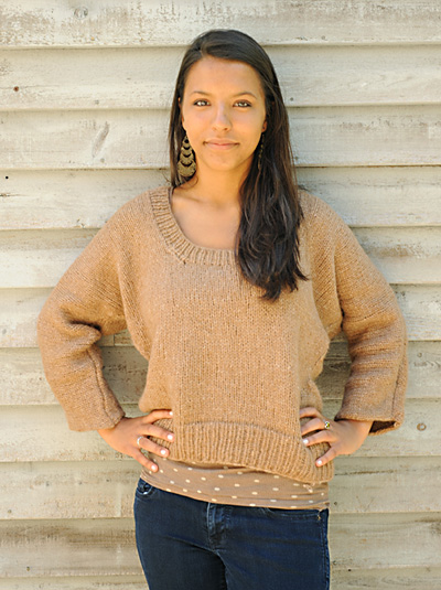
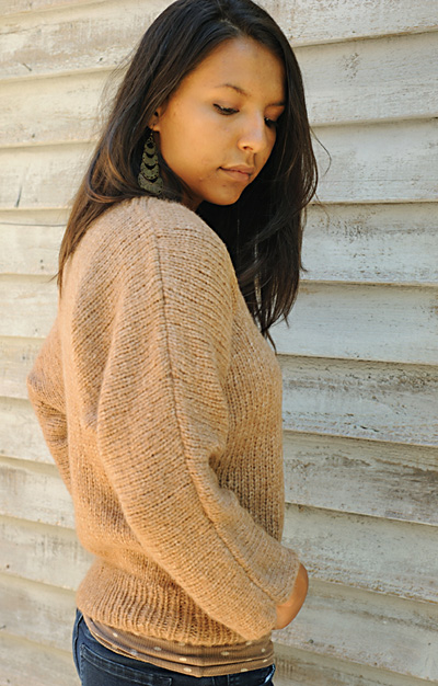
Takoma
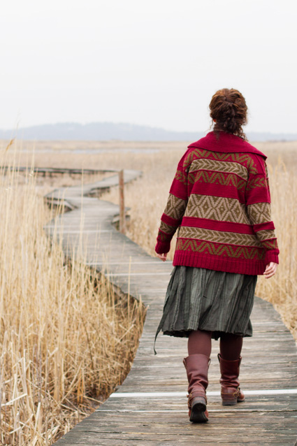
Damn, Knitty Deep Fall 2011, starting out with a bang! Takoma isn’t in my usual vein at all—no waist shaping, totally rectangular, positive ease, bulky gauge—but I love it. I’ve never even been that into Cowichan sweaters; I always think of the ones with, like, bison on the front and while they are exceedingly handsome and an important cultural tradition of the Coast Salish First Nations peoples, it’s just really…not me. But Takoma is making me go back and reevaluate that entire look.
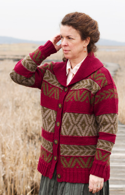
It’s the colors that do it, you see. Shapewise, Takoma is nothing new under the sun. It’s the colors in conjunction with the choice of colorwork motif (and some smart styling) that take this sweater from “eh” to “wow.”
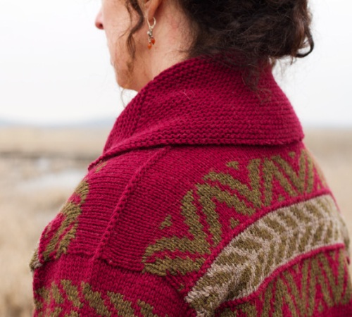
I think I’m pretty good at color pairing, but this colorway isn’t one I would have ever picked–and yet it’s amazing. Colorful without being gaudy, earthy but opulent, rustic but not too old-fashioned. Gorgeous for fall and winter. The motifs are bold the way that Cowichan motifs should be bold, but they’re mitigated by some smart color choice and blocking—the olive green and tan are both receding colors, so the visual weight of their busyness is pretty much equal to plain wine-colored stripes.
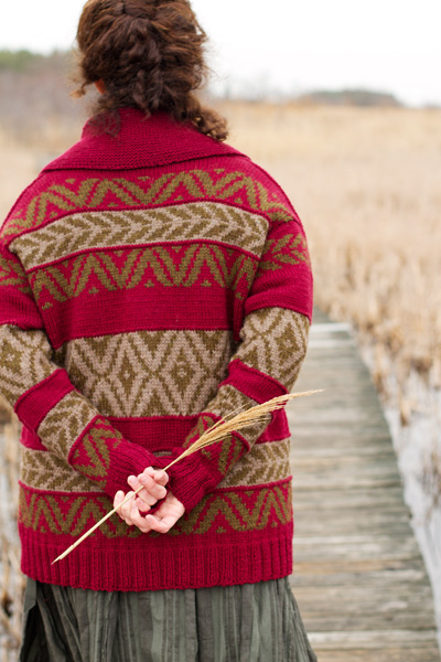
The styling is pretty genius, too. There’s a reason this design was picked to be the front page of the issue; everything about this photo works together to construct this slightly romanticized image of a no-nonsense (oversized worsted sweater, flat boots, tumble-down hair, sensible skirt), competent (purposeful posture, gorgeous handknit sweater) woman. She’s figuratively tied to the earth with the blade of straw that she’s holding (and how exquisitely does that pale gold cut through the rich, heavy colors of the sweater?) but she’s literally Going Places on that winding path, and god help anybody who gets in her way. Well done everybody who had a hand in that photoshoot.
Of course, there’s a downside to everything. It’s a beautiful unshaped sweater, but it is a totally unshaped sweater, and it can make you look barnlike if you’re not careful. I don’t like that much positive ease even in my actual coats.
But since this is knit flat and seamed anyway, it shouldn’t be any harder to add some shaping while you’re knitting it if you want to. How stunning would it be to knit Takoma in a shape more like this Curling Jacket by Eddie Bauer? It’ll probably cost you less than $130 in yarn, too.

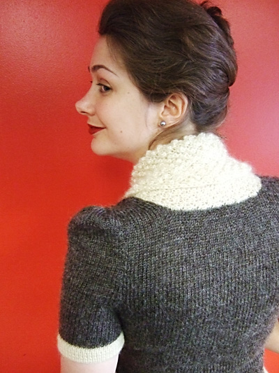
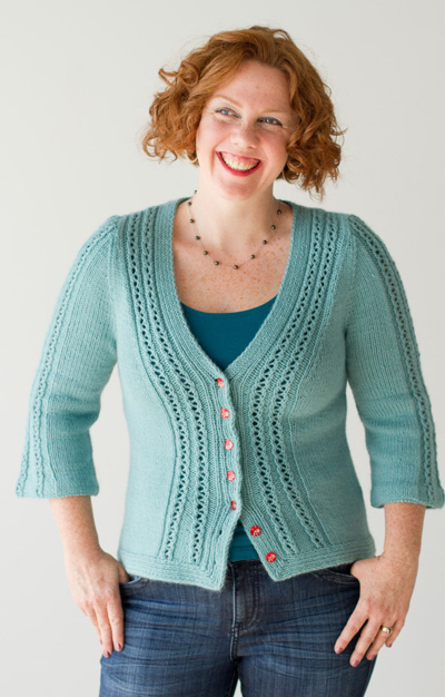
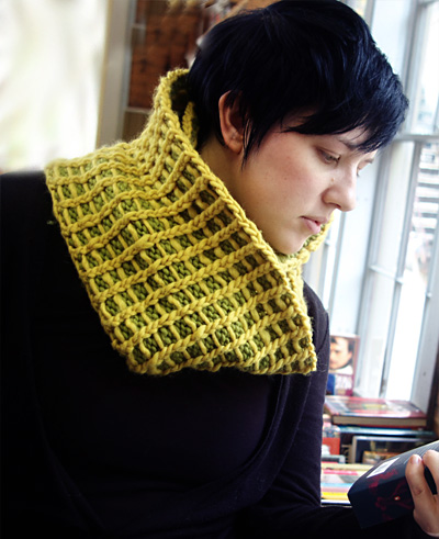
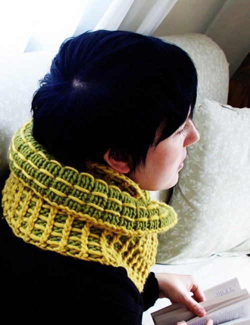
When Samson Met Lila
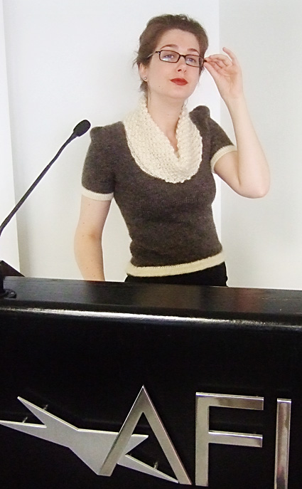
When Samson Met Lila is my hands-down favorite design of this issue. I’m totally biased, though, because I can hardly imagine a design that would be more squarely up my alley. Slim-fitting, sophisticated color choice, puffed sleeves, a little retro, and both cowl- and scoopneck at once? Those are all design elements that suit my style sensibilities and the particular strengths and weaknesses of my figure (oh, small bust, I love you, but you make things difficult sometimes.)
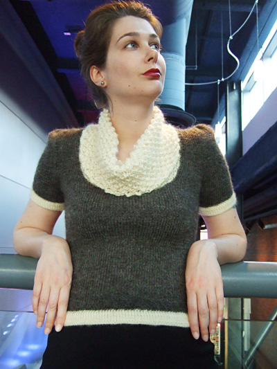
I have to give props to the sample knitter, because that sweater fits the model like a glove.
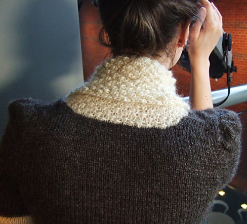
The designer also made a host of good decisions, but I want to particularly highlight the way the stockinette lets the natural luster and halo of Wensleydale really shine (see what I did there?) I love it when yarn choice informs design and vice versa like this to create a harmonious final product.
On a nerdy and fannish note, I think Samson+Lila would make excellent House sweaters. Think about it—House colors, maybe a double stripe instead of single at the hems and cuffs, an iron-on Hogwarts crest? Pretty much the very definition of geek chic. It would also be cute if you made the base sweater without the contrast collar and cuffs and wore it over a half-sleeve button-down shirt.
The model’s tiptilty nose is really cute!
The Candles
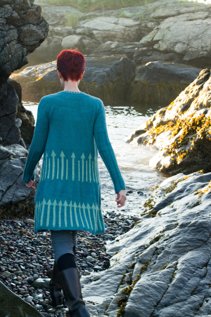
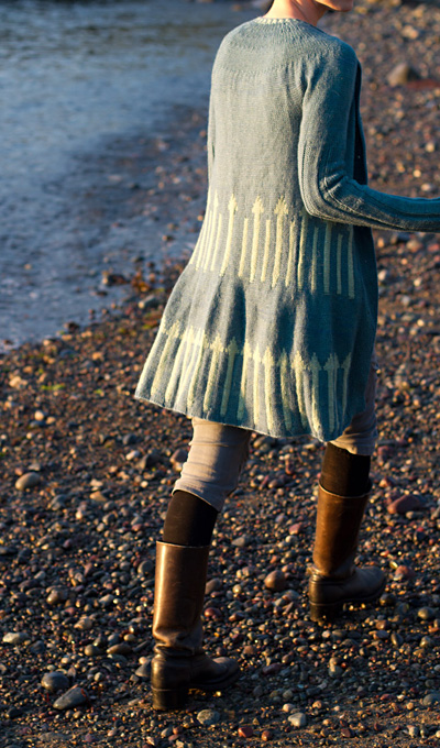
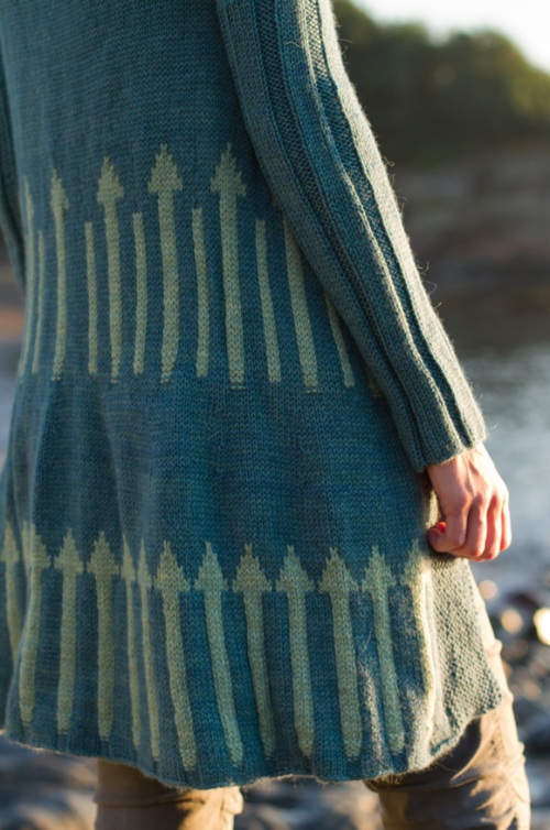
Okay, let’s address the giant elephant in the room: the designer can talk about Moby Dick and St. Elmo’s Fire all she likes. That’s where she drew her inspiration from? A+! I love a good literary reference. But no one else in the entire world will recognize it, because those aren’t candles. Those are arrows pointing up your ass.
They just are. And there isn’t anything necessarily wrong with that. There’s something pleasantly Mod and graphic about this coat, and it’s definitely a striking garment. However, the Candles suffers from some other design issues that I don’t think it fully overcomes, though.
First of all, the waist shaping is accomplished via stranded knitting.
The waist shaping of this cardigan is accomplished through stranded knitting. The naturally tighter fabric created by stranded knitting pulls in the fabric at the waist, creating a smaller circumference without changing the number of stitches.
For women whose figures run more towards the Joan Holloway than the Alex Wek, that’s just not going to work. Your colorwork gauge is simply not tight enough to decrease away the amount of fabric you need to get rid of.
Secondly, it’s hard to hit a gauge that’s tight enough to achieve the necessary shaping but not so tight as to make an uneven fabric. You can see in the photos that the sample sweater is a little lumpy in the waist (compare it to the photos of the Takoma sample, if you like.) Maybe that’s what the designer is going for? I’m not sure. It’s up to you, the knitter, to decide whether you like it or not.
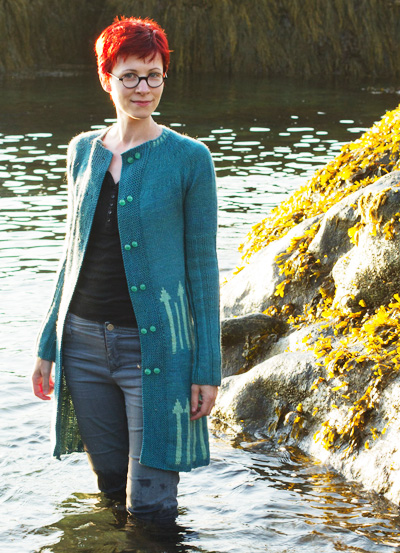
Thirdly, even if you have the figure for this coat and if you’re technically able to execute it well, the colorwork is totally in the wrong place for waist shaping. It’s definitely hitting the model’s hips and not her natural waist, which is around 4-6 inches to the north, there.
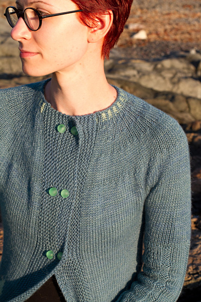
The other awkward design element is the double-breasted front. I know it’s supposed to keep the nautical theme and hearken back to sailors’ peacoats, but like, come on. This is at best a one-and-a-fifth breast. It’s practically the smallest double breast I’ve ever seen. I can kind of understand, because proper double breasting tends to not work well on knit garments and often goes hand in hand with grotesquely pulling button bands, one of my pet peeves. (Come on, you know exactly what I mean.) But in that case, just make it single-breasted. It’s fine! I get the feeling that this is a situation where the story that the designer wanted to tell overwhelmed the actual design. Seriously, if the concept is getting too off base, just let the concept go and make an attractive, functional garment first.
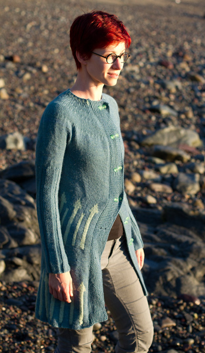
I actually think that this coat would be much cuter with just a single column of larger buttons running down the front.
Tenney Park
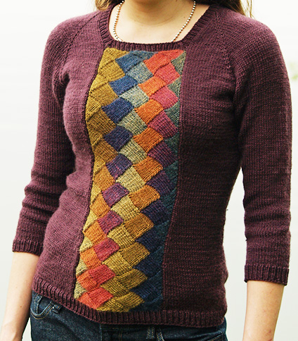
I think lots of people will compare this to the Apothecary Raglan from the WS 07/08 Knitscene, and they certainly riff off of the same general idea.
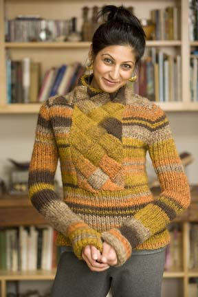
But when Apothecary came out, I thought of it as one of those patterns where there’s an idea there, a kernel of something innovative and good, but there were also a bunch of missteps that took the design a little off course. I think Tenney Park fixes a lot of the issues that Apothecary had to emerge as a more successful design overall.
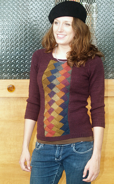
The most important of those fixes is, of course that Tenney Park uses a solid for the main color. Not only do Apothecary’s stripes clash with the entrelac panel, they clash with each other. It looks really odd when the left chest has skinny stripes and the right has wide bands of color. But Tenney Park neatly sidesteps the issue by using that rich plum, which is a great choice to set off the warm 70s colors of the entrelac panel (Mini Mochi looks really great in this application, by the way. I like its smooth transitions and rich, homogenous colors more than I do Noro’s, which tends in my experience to be kind of speckly and have that one bizarro color per ball. But I digress.) The other two awkward things about Apothecary are both related to proportion. The way that the entrelac inset stops suddenly midchest makes it look biblike, and the long sleeves, turtleneck, and heavy quilted-looking front conspire to give a very claustrophobic, swaddled feeling. Tenney Park’s scoopneck and 3/4 sleeves expose just enough skin to avoid that stifled look, and the full column of entrelac makes a strong vertical visual statement that’s flattering on many different body types.
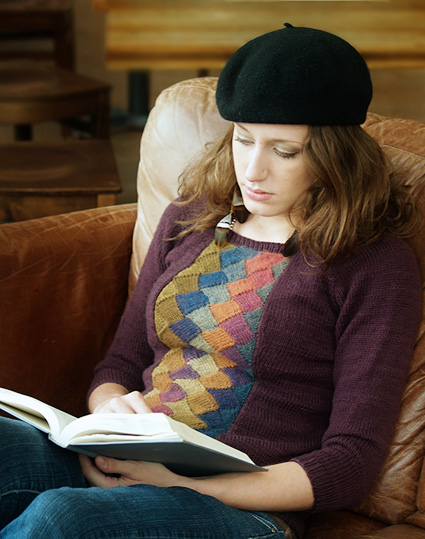
This photo shoot is another great example of how to use styling to help tell a story? The body-skimming shape of the sweater is deliciously retro-40s sweater girl, but the color choice, jewellery, and beret take forward thirty years like a 70s girl thrift shopping for sweaters from the 40s. But the pairing of the sweater with jeans and a layering tee feels pretty modern, making it a woman in 2011 knitting a sweater that looks like a 70s girl found it in her mother’s closet from the 40s. Needless to say, I LOVE IT.
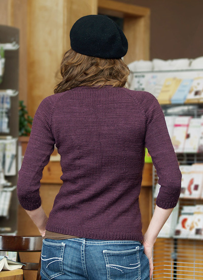
This is another sample knit that fits perfectly.
Friendly Grey
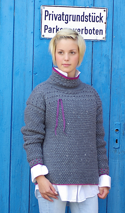
I honestly just do not understand this sweater. Where would you wear it? Why is there a…shoelace? Ribbon? Threaded through the one side? Why does knitting with a yarn that’s been “drenched with lavender oil” (but is unscented) “make all the difference”?
Frankly speaking, you could find this weirdly textured, bulky, oversized, drop-sleeved, high-necked sweater in any free knit-your-first-sweater pattern booklet from 1985. It’s just not very attractive or current.
Flügel
First of all: alpaca blown into a mesh tube of silk? Oh my god, don’t mind if I do. I’m curious as to how well the yarn wears, and whether the alpaca settles over time or not. So cool!
But as for the actual design of the sweater…I don’t think it’s very strong. Cropped length, dolman sleeves, oversized fit, and bracelet length sleeves? The sleeves and the hem sit at the same place on your body, so this sweater is just an enormous bag of fabric that sits on your body until it abruptly cuts you in half all the way across. It looks weird.
When it comes to sack dresses and oversized sweaters, I feel like you just have to go for it. None of this “if you’re between sizes, size up” stuff. Size up. Two or three or four sizes. You want to come down on the right side of the fine line between ‘look how tiny I look in this ENORMOUS SACK!’ and ‘look how I kind of…fill out this ENORMOUS SACK!’
On a personal level, I wouldn’t want a snuggly oversized sweater to have bracelet sleeves. I want the cuffs long enough to pull over my wrists as I cuddle my mug of hot chocolate, dammit. Takoma up there does this more to my satisfaction.
Vignette
How lovely! I have a weakness for classic, wearable cardigans with nice detailing. Will this retro-inspired little cutie set the fashion world on fire? Well, no. Is it kind of the same as Emelie, Amelia, Miette, or Velynda? Yeah, pretty much. But it has great finishing and an interesting construction (the button band is knit first, then you turn a mitered corner and pick up your body stitches from along its length), it’s office-appropriate, and it’ll make you look good. There’s nothing at all wrong with that. I understand if you find it boring, though.
Personally, I’m actually not a fan of bell sleeves, even ones as small as these, so I would probably just keep the sleeves going straight in pattern at the cuffs.
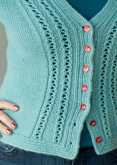
Those red floral buttons are perfect for the milky aqua of the sweater. And check out how precise that mitered bottom corner is. Delicious.
Auguste
Dear Reader, I beg you to imagine my face as I read the little piece of doggerel in the designer’s note of this pattern. I think my personality comes across in this blog well enough for you to get some inkling of how much I hate incompetency. NO GODAWFUL, SELF-INDULGENT POETRY IN YOUR NOTES, IF YOU PLEASE, DESIGNERS. Not even when you admit to its awfulness in your other designer’s note. You have been put on notice.
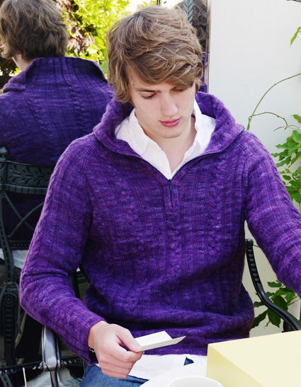
It’s somewhat surprising, therefore, that the pattern itself is actually a really handsome and classically wearable henley, styled beautifully by the designer. I know a ton of guys who would wear that sweater–maybe in a different color, but the essential design is absolutely solid. Interesting enough for you to knit, basic enough for him to wear, stylish enough to make both of you feel good about it. What more can you ask of a men’s sweater pattern? If you’re a speedy and dedicated knitter, you could even produce one in time for the holidays.
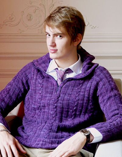
Dress it up with khakis and a tie (that TIE. GUH.)
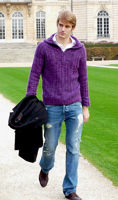
Ditch the tie, pop the first couple of buttons, and dress it down with some torn jeans. Perfect.
Yeah, it’s like $200 for the smallest size in the recommended yarn, but shit, we all know how to substitute yarns, don’t we? As long as they’re not recommending that I knit a ten-foot long scarf in superbulky single-ply pure cashmere for $400, I won’t rag on designers too much for sample knitting in expensive yarns.
Microprocessor
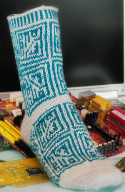
This hits the geeky sweet spot for me. Unlike The Candles, it’s referential enough that people may get the joke on their own without having to be told. Unlike Morse Code from Knitty First Fall 2011, it has a basic aesthetic value beyond just its geekiness.
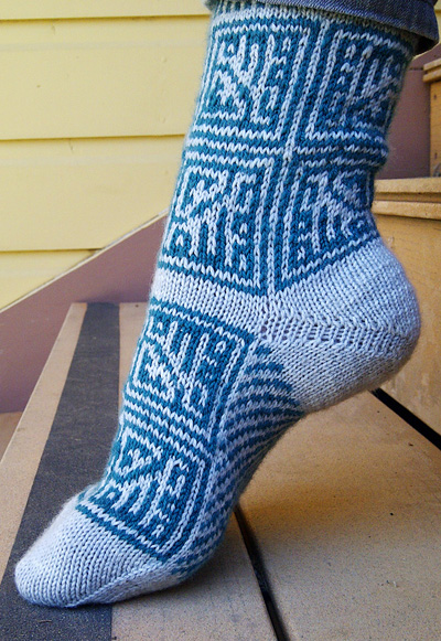
If you find that short-row heels are consistently too shallow for your foot, this pattern also throws an extra couple of rounds in there to accomodate you, which is cool. I like how the computer chip colorwork updates traditional Nordic patterns in an abstract and asymmetric way.
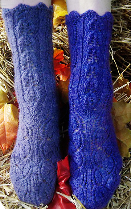
Glomerata
Has anyone been keeping track of my pet peeves? I have a lot, okay, I’m sorry.
Unfortunately, Dayflower Lace is one of my biggest. Is it because it’s leaf lace? Is it the size of the leaves relative to the size of the motif repeat? Is it the fact that it’s in the Walker Treasuries, and thus, everywhere? Is it something else? Who knows? Dayflower’s like nails on a chalkboard to me.
So sorry, Glomerata, it’s not you, it’s me. I also dislike the wavy top cuff; I think it looks a little callow.
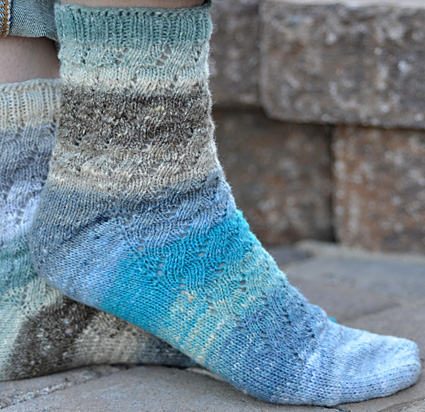
Paper Moon
Well, they’re nice socks. I don’t know if there’s really that much else I can say about them; they’re classic, I like the use of garter stitch in the round, and they look good. They would make nice gifts.
Mortar
I think this pattern is pretty neat, without necessarily finding it to be a pattern that I want to knit. Honestly, I don’t find the finished object to be all that attractive; it’s bulky in the way that suggests stiffness instead of snuggliness. But the stitch itself is interesting! I think the combination of wrapped stitches and slipped stitches would make a great scrubby or dishcloth—that’s not a slam, honestly. I just moved into an apartment without a dishwasher. I understand the necessity of scrubbies.
If you do wind up making a cowl, I agree with the pattern’s wearing recommendations–rolling it into a shawl collar shows off the reverse side in an interesting way.
Semiprecious
Someday, there may be a pattern that makes me appreciate geometric eyelet lace; this is not that pattern. I just always think it looks lazy.
Apis Dorsata
So I guess bees are in right now, huh? My pet peeve with this design is that the lattice just isn’t hexagonal enough for me. REGULAR HEXAGONS ON MY BEE-THEMED DESIGNS OR BUST. Otherwise, it’s fine, kind of nu-Jane Eyreish.
I think it’s actually weakest in unfurled shawl form because it’s too literal; I prefer it kind of scrunched up as a scarf because then the honeycombs form a neutral textural element rather than being like BEES BEES BEES I LOVE HONEY MY NAME IS POOH BEAR.
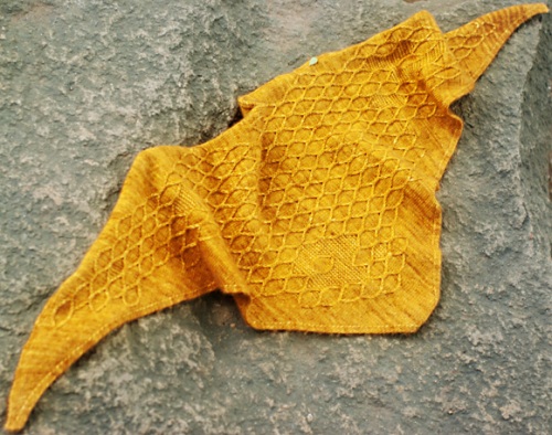
Callette
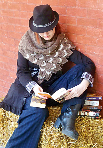
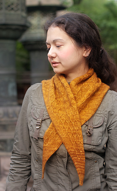
Full disclosure: I love Diana Wynne Jones. Fire and Hemlock is my favorite book. Other people can fight over Mr. Darcy or Mr. Rochester all they like; Tom Lynn is hands-down the sexiest literary character for me. I’ve read Dark Lord of Derkholm and Year of the Griffin more times than I can count; I find the latter particularly endearing because it captures the thrill of learning perhaps better than any other book I’ve read.
So I’m certainly predisposed to like this pattern. It’s a little bit kitschy, maybe, but like Microprocessor, it hits the geeky sweet spot for me. The white chevrons and scalloped edge suggest barred wings without being literal or embarrassing about it, the way Lilah from Knitty Spring/Summer 2011 was maaaaaaybe kind of literal and embarrassing. Even if you don’t know the background and symbolism associated with the shawl, chevrons are always a really clean and graphic detail.
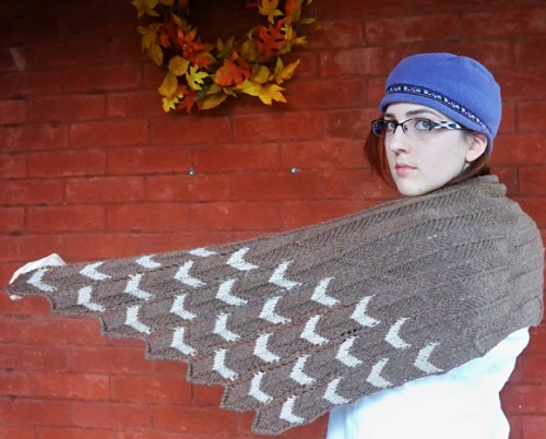
Wisely, the designer kept it quiet in the rest of the design with only some incidental texture to compete with the showy colorwork wingtips. Nicely done.
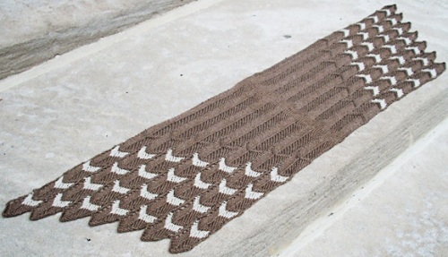
And of course, five stars for an impeccable blocking job! It’s so nice to see, and I really just don’t understand why people don’t bother to block their sample knits nicely.
However, I have to ding the styling of the photoshoot, which is just…let’s be frank, bad.
So…many outfits? It doesn’t look like the designer’s trying to show off how versatile Callette is the way Auguste‘s designer did; it just looks like the model is wearing multiple not-particularly-well-chosen outfits with Callette. That cool purple hat looks particularly out of place against the warm browns and rich autumnal reds of the backdrop there. These are small choices compared to actually designing a garment, but like blocking, they matter.
Oh, one last suggestion for a geek-chic colorway:
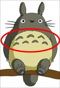
Awwww yeah, Totoro scarf!
Mathematix
There’s something off about this pattern, but I can’t quite put my finger on it. The two-color chevrons and stripes are already so eye-dazzling that I think it’s overkill to combine them with eyelets in the same pattern. When you think about it, eyelet patterns add complexity in terms of texture, transparency, and color (whatever you’re wearing underneath). It’s just overwhelming.
You’re not a WWI era battleship, you don’t need dazzle camouflage.
Alda
WHAT THE FUCK IS THIS SHIT.
That is a very pretty girl getting eaten alive by a sea anemone.
After the Rain
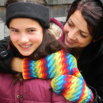
These mittens self-select really well in that you know already whether you’re dying to knit them or not. There is nothing in the world I could say to change your mind about them.
That said, yay Pride mittens!
Ambroso
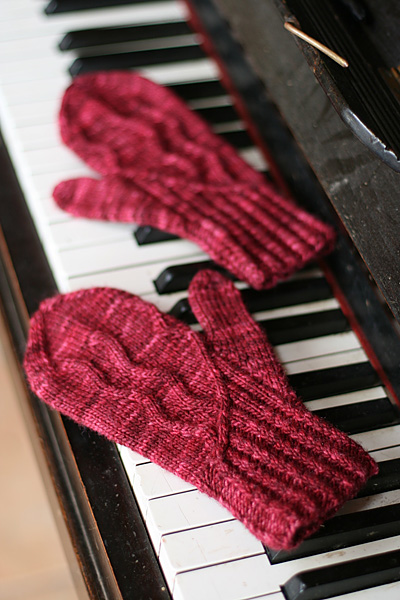
These mittens, on the other hand, are unattractive. Pun unintended.
Spatterdash
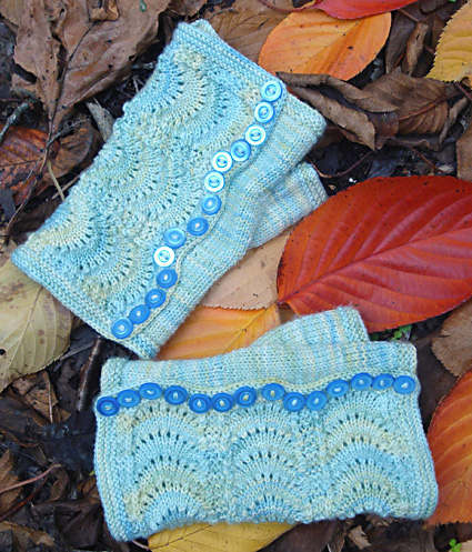
Pretty cute. I’m hearing a general consensus of “great for steampunk!” and I have to agree. Feather and fan can look pretty overplayed, but using it vertically here makes it look more elegant/less overdone and the buttons give so many possibilities for ornamentation. And really, aren’t we all sick of steampunky cuffs that look like Marylebone Gardens Cuffs and Mrs. Beeton and Tudor Rose?
Maybe that’s just me. (Bell cuffs, people. I’m not a fan.)
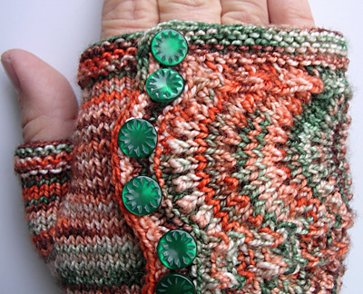
One last thing: for the love of God, I don’t care how cute your matching buttons are, don’t waste them on making these in strongly variegated, complementary-color yarn. NO LACE IN HEAVILY VARIEGATED YARN. STOP IT.
Ogiku
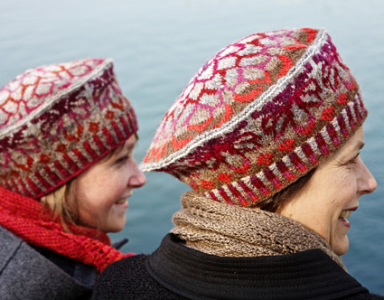
Lord, this is a very…tam-y tam. I tend to really not go for this shape of hat, since it makes my head look like a drunken barstool, but obviously your mileage may vary on that.
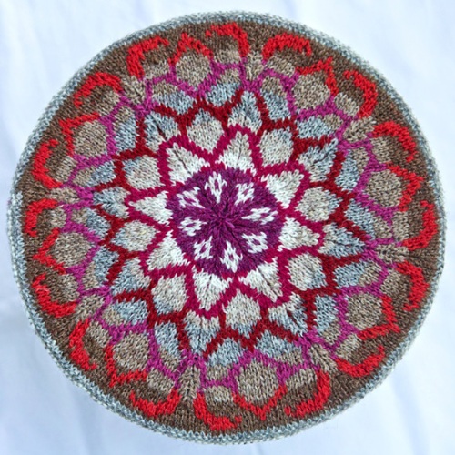
It’s really a gorgeous piece of colorwork, though. As expected from Jamieson, the Spindrift colors are rich and complex and lovely. It wouldn’t be hard to mod it into a slouchier shape to knit it for myself…decisions, decisions.
Weeping Willow
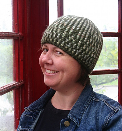
There’s certainly nothing particularly wrong with this hat, but I’m just not feeling it. Perhaps too busy, or too abstract? I feel like if you’re looking for an art deco hat in this general shape, Undergrowth from Knitty Winter 2011 is a more attractive option.
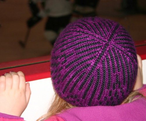
I do appreciate the neat way the decreases slope in at the crown, though. Thoughtful detailing will get points with me every time.
Kiwi
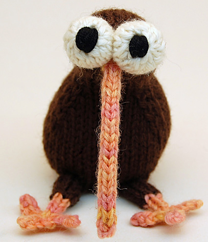
Oh, Bizarro Knitty. There’s always something, isn’t there? But this kiwi is more broadly appealing than the Hana Hou the ukulele case from Knitty First Fall 2011 and way less creepy than Chow the mouth model from Knitty Deep Fall 2010 .
Countdown until someone makes a knitted/papercrafted remake of that iconic kiwi animated short (warning: sad!).
Oh dear. This issue’s surprises were…not good. It’s disappointing, since the rest of the Deep Fall 2011 was so strong! These two patterns seem like an afterthought.
Uzu
There’s just nothing to this sock design. Allover lace design from every stitch dictionary ever + toe from here + heel from there? There’s nothing distinctive about it; I’m looking at the photo and can barely remember what it looks like.
Shapely Boyfriend

This pattern is also maddeningly generic. It looks like you bought it at Old Navy. I know I praised Vignette up there, and that’s not exactly at the forefront of knitting technology either, but Shapely Boyfriend is like a slice of Wonderbread. Sure, you can bake your own doughy lowest-common-denominator sandwich bread, but…why would you?
If I were looking to knit a basic cardigan for myself, I would make Delancey Cardigan or Mrs Darcy instead. If I wanted to make a boyfriend-type cardigan (which I think should be oversized, by the way) I’d go for Frankie.


Yay! You’re back! I’m dying at the “drunken barstool” bit!
By: yarnexploder on October 30, 2011
at 1:12 am
It’s true! It’s really bad; I’ve come to terms with the fact that I need some sort of slouch or brim on my hats or else I look absurd. 😦
By: ritsukurimono on October 31, 2011
at 11:06 am
So good to see you’re back, I love to read your reviews!
By: limescented on November 1, 2011
at 5:36 am
Thank you! That’s so great to hear. 🙂
By: ritsukurimono on November 1, 2011
at 8:18 am
I liked Tenney Park when I first saw it in Knitty, but your post made me love it even more. I hadn’t seen Apothecary before, so I really liked the comparison. I might just add Tenney Park to my queue!
By: Kristen Maier on November 4, 2011
at 8:05 pm
I’m glad you liked it! I would queue it myself, but I’m trying to stash down and I have no color changing yarn right now. I’ll learn entrelac and do it someday!
By: ritsukurimono on November 5, 2011
at 9:19 am
[…] Knitty Deep Fall 2011 surprises have been posted! I updated my review post here with my opinions about the new patterns. I was underwhelmed, particularly because it was otherwise […]
By: Looking back at stuff we’ve done « ritsukurimono on November 11, 2011
at 1:03 am